 Driving Dashboard Development. Step-by-Step Guide to Generating Relevant Fundraising Dashboards.
What’s the first thing you do when you get into a new car? Adjust the seat, adjust the mirrors, check the gas gauge, set the radio channel (and volume). Once you’re confident it feels right, you look both ways and you’re off!
Just like driving a new car, the process for driving dashboard development takes some planning and initial adjustments to set you on a course for success.
And as every make/model car is different and every driver is different, so too is the need for driving dashboard development. How do you prioritize your dashboard needs as a fundraising professional? How do you develop relevant fundraising dashboards? Here’s where our new blog comes in.
Driving Dashboard Development. Step-by-Step Guide to Generating Relevant Fundraising Dashboards.
ON YOUR MARK: Development/CRM Dashboards.
A dashboard is a set of charts that are powered by reports in your donor management database that display your data in varying formats. They provide a quick way to review data such as progress to your annual goal, breakdown of event expenses, or top lead source for donations to your capital campaign.
GET SET: Choosing Your Reports and Dashboard Components.
Dashboards will only serve you well if you’ve been able to identify key metrics that will bring meaning to your role in the organization. There might be an ‘out of the box’ dashboard available in your current CRM donor management solution, but you want to be sure it’s based on the information you actually rely on. Questions to ask yourself when choosing the right reports to include in your dashboard:
• What numbers are you asked to monitor?
• What metrics does your organization compare on a calendar or fiscal year to measure growth and/or success?
• Are there areas currently not being measured?
• What is your role in the organization and what data do you need displayed to fulfill your job responsibilities?
In this blog article we will create a common nonprofit report and its corresponding dashboard component that can help you get started. Our step-by-step instructions feature the Salesforce Nonprofit Success Pack Lightning Interface.
GO! Directions for Creating a Fundraising Year-To-Date Goal Meter.
One of the most popular performance metrics is measuring fundraising efforts against your goal throughout the year. This can help you determine if additional events, mailings, or other fundraising initiatives are needed to ensure your organization reaches its goal for year. This example will show you how quickly and easily a YTD Performance gauge can be set up.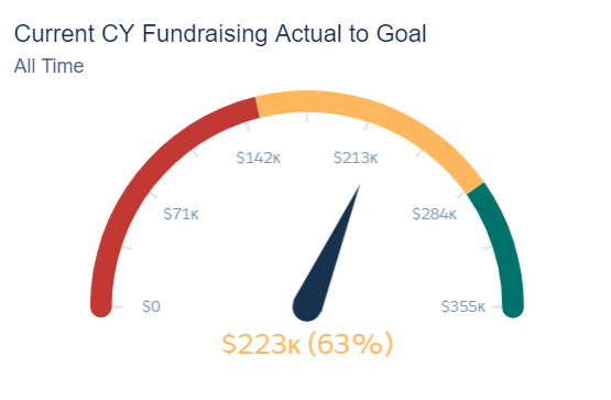
In this example, our total fundraising goal for the current calendar year is $355,000. We are 63% to our goal by raising a total amount of $223,000 dollars so far this year.
Step 1:
We will create an Account Report. We are choosing this report type because we are running an Account Report to include both Organization and Household giving for this year. Choosing the correct Report Type is the first and most crucial part of reporting. Please contact us if you’re having difficulties understanding how to choose your Salesforce Report Type.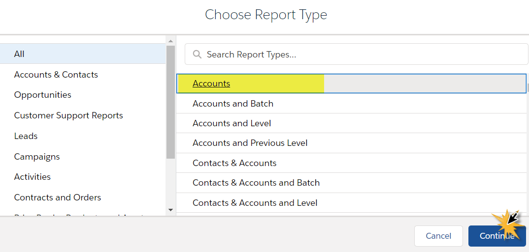
Step 2:
By default, Salesforce includes two default filters that we will want to remove to ensure that we are showing All Accounts for an accurate Giving Total. Click on the Filter Tab to see the default filters: Show Me (this is account ownership) and Created Date.
Click on the ‘Show Me My Accounts’ and change this to ‘Show Me All Accounts’. Next click on the ‘Created Date On or After’ {Date} and change this to ‘Created Date All Time’.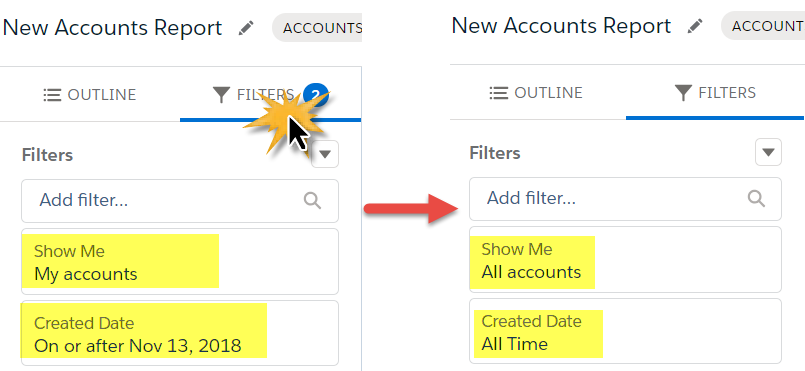
Note: By opening your report up to show all accounts and a created on date – this will open your report up to ALL Accounts, whether they have donated or not. Since the goal of this report is to give us a total of all giving in the current calendar year, we might only want to see Accounts that contribute to that total. To remove any Accounts that have not given, we could add a filter in this section which would be Total Gifts This Year to not equal 0.00.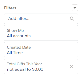
Step 3:
By default, Salesforce also shows some standard fields that may not be benefical to the report you are running – like Account Owner, Last Modified Date, etc… You can remove these fields out of the report by clicking on the small arrow on the column you wish to remove and selecting ‘Remove Column’. OR, in the Report Writer, you can choose the ‘X’ on the column you wish to remove.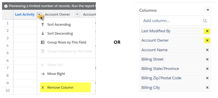
Step 4:
You can set your report up to include columns like Account Name, Address, or any other demographic fields needed from your environment. But as we saw in our example above, we will only be displaying a total sum number of this year’s donations – so your demographics won’t actually show on the dashboard.
Make sure you include the ‘Total Gifts This Year’ field. This is a Nonprofit Success Pack field and the field we will use to gather the sum of all giving from Accounts for this calendar year. Click on the arrow next to the field, choose the Summarize option and select the ‘Sum’ option. This is important to summarize so that our dashboard knows to use this Sum Total to compare to the Goal we set.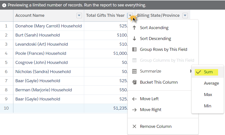
Step 5:
In order to plug a report into a Dashboard component, it will need to be a Summarized Report. Search for a field you wish to group the report by clicking in the Group Rows field and searching for the field you will use.
Although the grouping is not relevant to this specific gauge graph, you might choose to group your report by something that you can reuse for another Dashboard component. Grouping your accounts by Record Type (Business or Household) or by State would allow you to plug this report into another graph to compare gifts across donor type or location.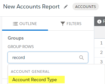
Step 6:
Save your report to the appropriate Public report folder. You can now decide whether you will add a dashboard component to an existing dashboard or set up a brand-new dashboard.
For our example, we will set up a new dashboard.
OVERDRIVE! Creating the Actual Dashboard Metric.
1. Open up the dashboard tab and choose ‘New Dashboard’. Give this dashboard a name like Development Metrics. If you ever intend to share this Dashboard with others, make sure you save it in a public Dashboard folder.
2. Click the ‘+ Component’ button.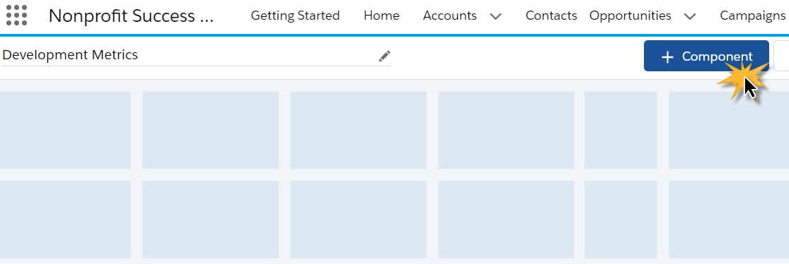
3. Find and choose the Summarized Account report that we created in the first 5 steps. Choose the gauge looking graph from the tile options on the left hand side of your component set up.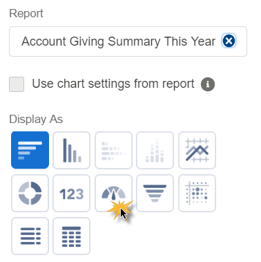
4. With the gauge component, you will be given the ability to set your goal metrics with 4 numbers. Using the Segment Ranges, set your lowest goal, and continue to enter the following three segments, with the last being your overall goal. Once these segments are set, the gauge will show you a preview of your segments.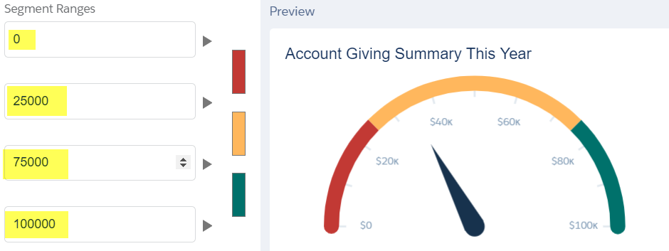
5. There are other formatting options which we think are helpful for this type of dashboard, and that is to show your total raised so far and your percentage to meeting your overall goal.
• Show Percentages: this shows your percentage to overall goal
• Show Values: this shows your sum total of all giving this year
• Show Range: this shows which range your sum total is currently within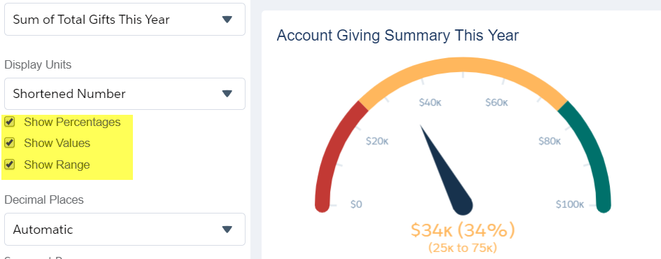
6. There are other options in this set up – changing the gauge colors, showing whole units versus abbreviated units, or changing your component’s name. These are all optional but will not affect your view of Total Gifts This Year compared to the goal you set.
7. Once you are satisfied with your component options, click the ‘Add’ button.
8. Make sure to save your new dashboard (top right hand corner) when you are done with your changes and you are ready to move onto your next task in Salesforce.
CROSSING THE FINISH LINE.
It’s a journey to develop and fine-tune the reports and dashboards you and your team rely on. If you have questions about running reports or the types of dashboards needed for your organization, contact us.
Related Materials:
Dashboards for Nonprofits White Paper. Whether a new or skilled dashboard user, this Dashboard White Paper offers tips, tools, worksheets and guidelines to help organizations build and/or improve the dashboards they rely on for decision-making.
AccuFund provides a complete fund accounting financial management solution – available online or onsite – consisting of a strong core system and modules that allow you to expand as your needs evolve. It is known for its scalability, core function capabilities, reporting, integration and customer support. We enable organizations to streamline every aspect of their operations.
Technology advances coupled with AccuFund’s ongoing commitment to enhance its products has kept AccuFund at the forefront of fund accounting innovation. Through APIs, AccuFund solutions integrate with Salesforce for Nonprofits and other popular CRM systems to meet the unique needs of your organization; improving development, fundraising and management activities.